Japan Style: Architecture + Interiors + Design PDF
Preview Japan Style: Architecture + Interiors + Design
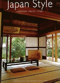
Japanese design strives to achieve a dynamic balance in ikebana as well as other arts. The concept of symmetry, so important to Western design, is considered static, and consciously avoided in Japan. Title page: Lit from underneath, the glass floor of the tokonoma alcove adds a dramatic modern note to the otherwise traditional muted colors and natural materials of this room. Japan Style architecture + interiors + design introduction by Geeta Mehta text by Kimie Tada and Geeta Mehta photographs by Noboru Murata Published Tuttle Publishing, an imprint of Peri plus Editions (HK) Ltd, with editorial offices at 364 Innovation Drive, North Clarendon, Vermont 05759 USA and 61 Tai Seng Avenue, #02-12, Singapore 534167. Copyright © 2005 Periplus Editions (HK) Ltd Photos © 2005 Periplus Editions (HK) Ltd Project Co-ordinator: Kaoru Murata All rights reserved. No part of this publication may be reproduced, stored in a retrieval system or transmitted in any form or by any means, electronic, mechanical. photocopying, recording or otherwise without prior permission of the publisher. LCC Card No 2005298891 ISBN: 978-1-4629-0595-9 (ebook) Distributed by: North America, Latin America & Europe Tuttle Publishing, 364 Innovation Drive, North Clarendon, VT 05759-9436, USA Tel I (802) 773-8930; Fax I (802) 773-6993 [email protected] www.tuttlepublishing.com Asia Pacific Berkeley Books Pte Ltd, 61 Ta1 Seng Avenue, #02-12, Singapore 534167 Tel (65) 6280 1330; Fax (65) 6280 6290 [email protected] www.periplus.com.sg Japan Tuttle Publishing, Yaekari Build1ng, 3rd Floor, 5-4-12 Osaki, Shinagawa-ku, Tokyo 141 0032 Tel (81) 03 5437-0171; Fax (81) 03 5437-0755 [email protected] Printed in Hong Kong. 10 09 08 6 5 4 3 TUTTLE PUBLISHING® is a registered trademark of Tuttle Publishing, a division of Periplus Editions (HK) Ltd. Front cover: The focus of traditional Japanese design is on space, and on how each object placed in space changes it dynamically. Architectural details are often bold, but designed so as to not detract from this space. Back cover: The room seen through this single paneled screen (tsuitate) is a mere five square metel's in area, but appears expansive due to the use of simple low furniture and uncluttered lines. Furniture-such as this display alcove, shelves and cupboards-are built into the room to achieve unobstructed space. The bold dark lines of the wood frames and tatami mat borders work with vertical and horizontal planes to create an intensely calm effect. Contents What is Japanese about a Japanese House? 8 A Tea Master's Dream Lives On 20 Summer Style in a Kyoto Machiya 38 Exuberant Spontaneity in an Interior in Osaka 52 House of Ikebana 68 A Kaga-style Teahouse to Sooth the Soul 76 A Celebration of Lacquer Craft 88 Coming Home to an Old Machiya 98 Antiques Find a New Home in an Old Minka 108
Description: