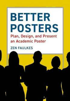
Better Posters: Plan, Design and Present an Academic Poster PDF
Preview Better Posters: Plan, Design and Present an Academic Poster
Better Posters The author in his natural habitat: presenting a poster at a conference. Better Posters Plan, Design, and Present a Better Academic Poster ZEN FAULKES PELAGIC PUBLISHING Published by Pelagic Publishing PO Box 874 Exeter EX3 9BR UK www.pelagicpublishing.com Better Posters: Plan, Design, and Present a Better Academic Poster ISBN 978-1-78427-235-7 Paperback ISBN 978-1-78427-236-4 ePub ISBN 978-1-78427-237-1 PDF © Zen Faulkes 2021 Foreword © Echo Rivera 2021 All images and figures are © the author unless otherwise indicated The moral rights of the author have been asserted. All rights reserved. Apart from short excerpts for use in research or for reviews, no part of this document may be printed or reproduced, stored in a retrieval system, or trans- mitted in any form or by any means, electronic, mechanical, photocopying, recording, now known or hereafter invented or otherwise without prior permission from the publisher. A CIP record for this book is available from the British Library This manuscript was written in Microsoft Word (www.office.com). Figures were made using Origin (www.originlab.com), CorelDRAW, and Corel Photo-Paint (corel.com). The “hand-lettered” typeface used in many figures is Unmasked from Blambot Studios (blambot.com). For my family: my wife Sakshi, my pack Max, my father Kevin and my mother Karren Contents Foreword by Echo Rivera ix Preface xii Acknowledgments xiii Introduction 1 1. Poster design: the short form 3 Part I For viewers 2. Attending a poster session 9 Part II For presenters 3. Why posters? 17 4. Design thinking 23 5. Early preparation 39 6. Narrative thinking 55 7. Visual thinking and graphic design 64 8. Figures 82 9. Presenting data 92 10. Colors 121 11. Beyond paper 133 12. Text and type 142 13. Layout 157 14. Grids 160 15. Background 177 16. Title bars 179 17. Blocks of text 188 18. Sections 201 19. Images and graphics, revisited 210 20. Fine-tuning 215 21. Before you print 221 22. Printing 226 23. Travel 232 24. Networking and presentation 234 25. After the conference 248 Part III For organizers 26. Poster session planning 259 27. Conference website resources 266 28. During the conference 269 Part IV What next? 29. Constant improvement 273 Afterword 276 References 278 Index 294 viii Foreword If you’re like most academics, you have not received formal training in verbal or visual communication skills. So, it’s not all that surprising we frequently commiserate about jargon-filled wall-of-text conference posters and #DeathByPowerPoint presentations. It seems that most (if not all) of us know there is a problem with how academia communicates their research and educational material. Luckily, there is a group of folks dedicated to fixing this problem and helping academics more effectively communicate their work. Zen Faulkes (or, as he is also known on Twitter, Doctor Zen) is one such person that has been helping academics create more engaging and effective conference posters for years. It’s why I am so excited for Doctor Zen’s book on poster design and was happy to write this foreword for this book. I train educators (e.g., academics, scientists, researchers, evaluators) to create visually engaging and effective slide presentations. In other words, my focus area is on ending #DeathByPowerPoint. There is, however, a lot of overlap between visual presentations and conference posters, and almost all the people I work with create both posters and presentations. So, I keep an eye out for poster design resources that I can share. Doctor Zen’s poster design website was one that I often shared with others. I published my first blog post about posters because I kept getting requests for templates, and even saw conferences starting to recommend or require templates. As a presentation designer and trainer, the number one biggest struggle for me is convincing people that a slide template will not solve their problems. I’ve lost count of the number of times folks have asked me to design a template for them, in hopes that this template will make their presentations visually engaging from that point on. It’s taken years of educational work to explain to folks that #DeathByPowerPoint is caused by something much deeper than the wrong template. The last thing I wanted was for the idea of a template to become expected (or even more expected) in the poster design field, too. The blog post I wrote about why templates aren’t the solution for posters (or presentations) caught Doctor Zen’s attention – that’s how we ix
